Lànnaru: Genuinamente Siciliano
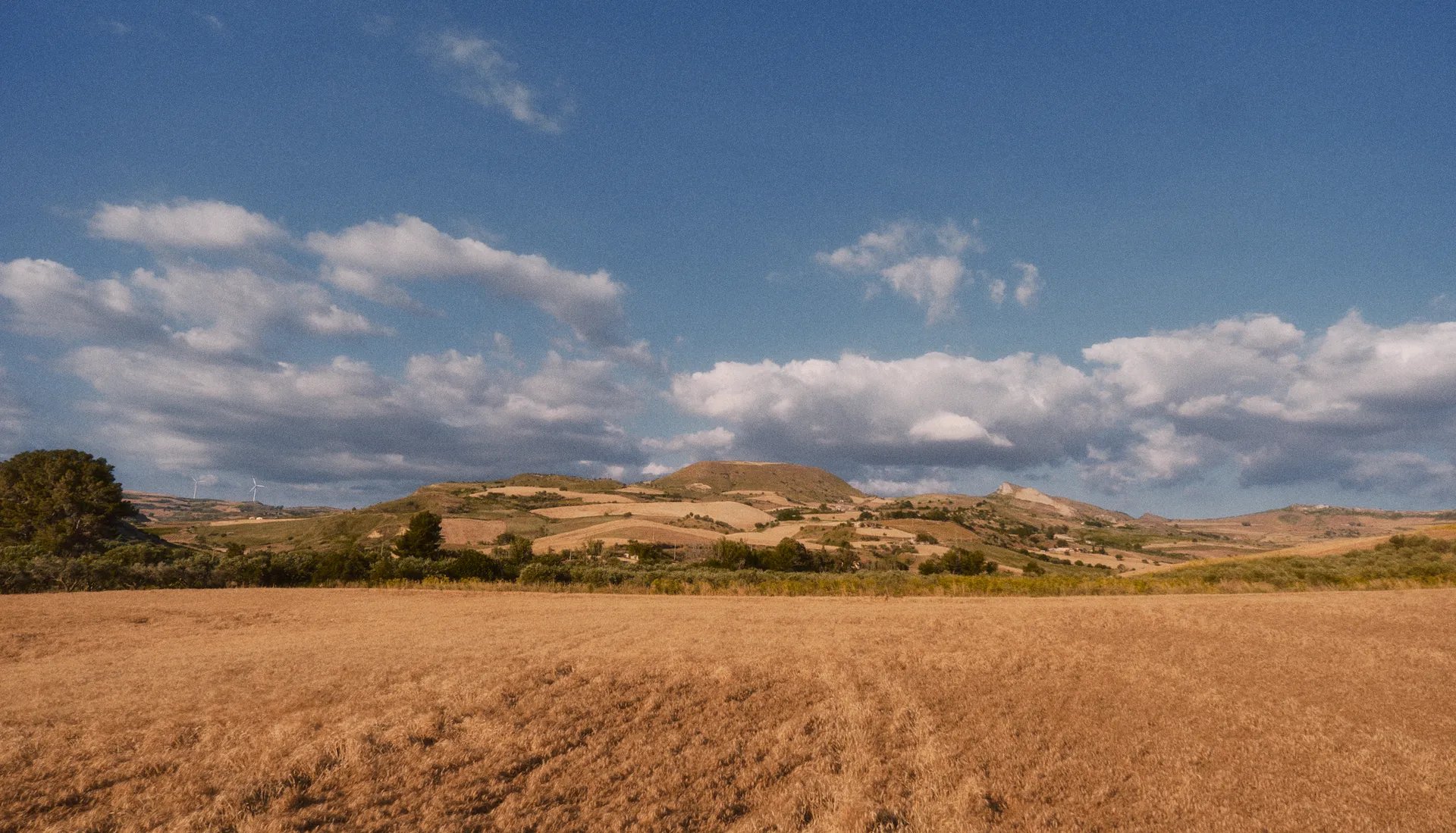
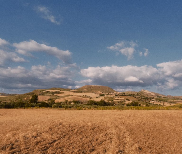
View of Feudo Landro, by Felipe Iglesias
Introduction
Sicilian agriculture lives with a cruel contradiction: exceptional, sought-after products, paid for like generic raw material.
The wholesale market doesn't distinguish between an ancient wheat variety grown without pesticides on limestone soil and one from an industrial monoculture on the other side of the world. Prices level downward, often below production cost.
For Agostino Cascio, who farms 65 hectares inland from Palermo using the same techniques as his father, with the rigour of someone who eats what he grows, the choice was clear: keep selling at a loss, or find a way to bring what he produces directly to the people who appreciate it, at a fair price, with no middlemen.
Lànnaru was born from that second choice. A brand built from the ground up to tell the story of where this comes from, its rarity and quality, and to sell it to people looking for products that are genuine, not just products that look like it.
Client
Azienda Agricola Cascio Agostino, Petralia Sottana (PA)
Services
Naming, brand identity, packaging, photography, video, e-commerce website
Country
Italy
Duration
Ongoing since 2025
Strategic positioning
"Genuinely Sicilian"
Today's food market is saturated with brands that talk about craftsmanship without having it, about terroir without knowing it.
Lànnaru positions itself the opposite way: no adjective without proof.
The audience isn't people looking for a Sicilian product as such. It's people who stopped trusting the label and are looking for the real thing, made in small quantities, available while it lasts. Rarity that isn't manufactured. Rarity that's real.
It isn't an aspirational promise. It's a commitment, a guarantee.
Naming
Landro is the name of the old baronial estate, part of which Vincenzo Cascio bought in 1959 and which Agostino now farms. Lànnaru is its Sicilian transcription: a language shaped by centuries of Greek, Arabic and Norman influence, with a sound that's exotic to outsiders and a geographic authenticity that's impossible to fake.
The name roots the brand in the land without falling into folklore. It doesn't describe the product, it tells its origin.
And it stays in memory.
Làn·na·ru
Visual identity
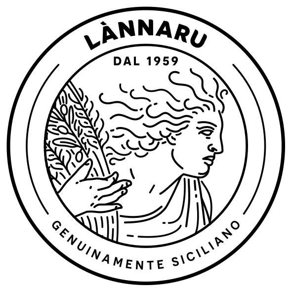
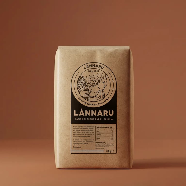
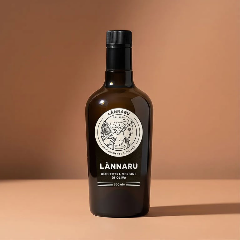
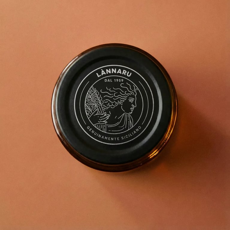
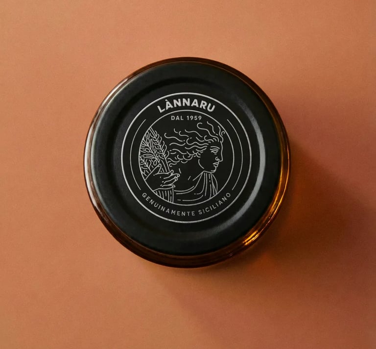
The isotype evokes the figure of Demeter, Greek goddess of agriculture and fertility: her gaze turned to the right, toward the future, expressing Lànnaru's bond with the land without nostalgia.
The figure draws on the bas-reliefs created by Maxfield Keck for Cincinnati Union Terminal, reinterpreted with a Renaissance-style line: rounded strokes that read as continuous at small sizes, but reveal a segmented structure up close. The result: a symbol that stays legible and clean even at the smallest sizes, without losing detail

The wordmark is built on Novecento, with adjustments to kerning, weight and serifs. Rationalist structure, contemporary sensibility.
The same principle applies to the whole visual system: classic elements of Italian and Mediterranean culture, reinterpreted to build something new and recognisable, not a period quote.
A sober identity, with nothing superfluous.
Packaging
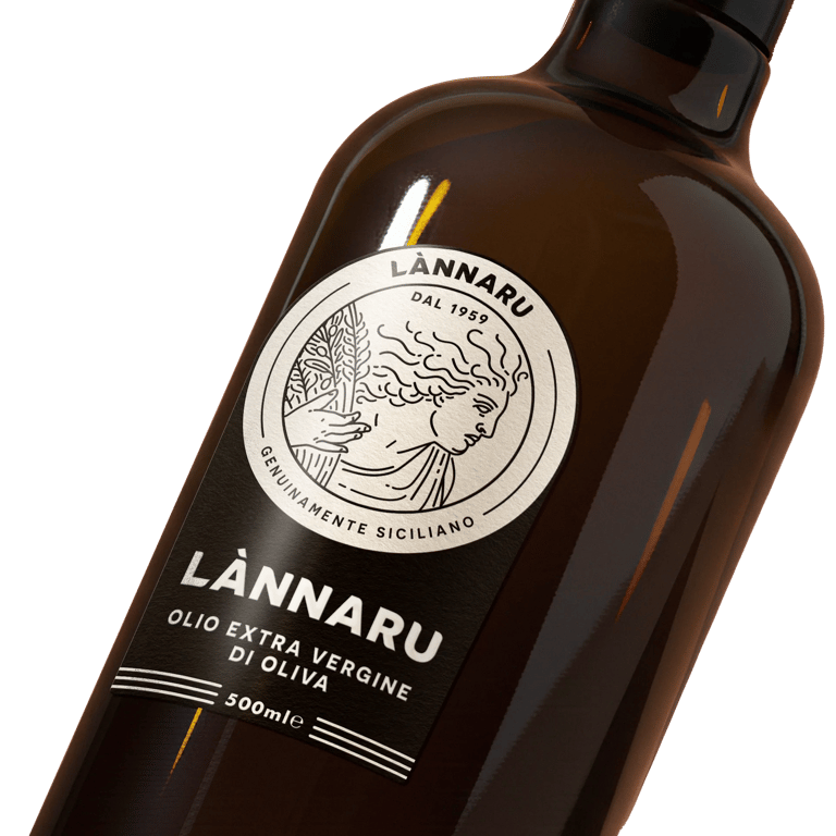
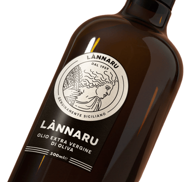
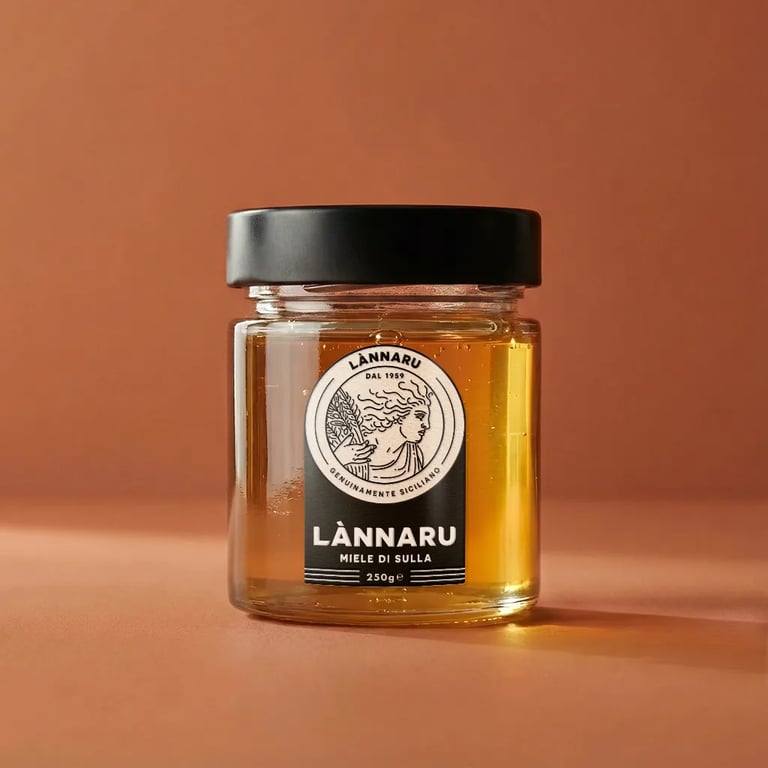
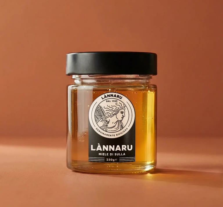
The packaging was built around one precise constraint: contained cost, premium presence.
We selected bottles, jars and paper packaging already available on the Italian market, choosing shapes and materials with inherently high quality.
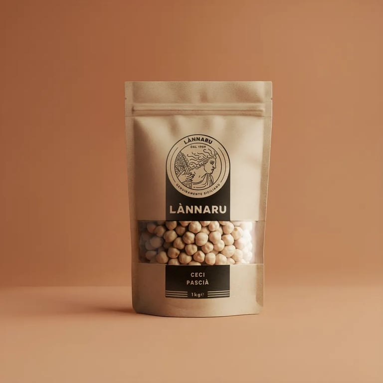
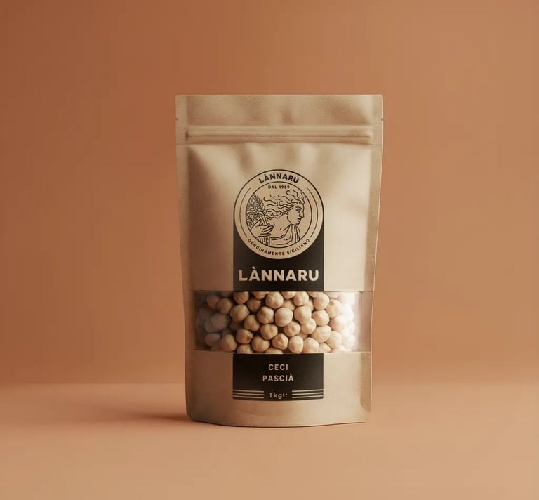
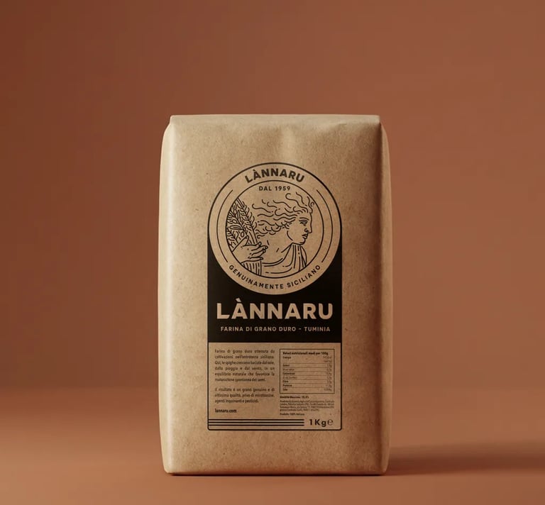
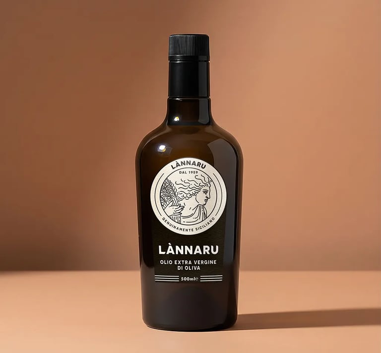
The brand's graphic application on coloured paper, with a single ink, does the rest: few elements, careful attention to proportion and placement. The result reads as a step above, but restrained, exactly what a small farm can afford to do without compromising the sustainability of the project.
Other packaging examples
Photography and video
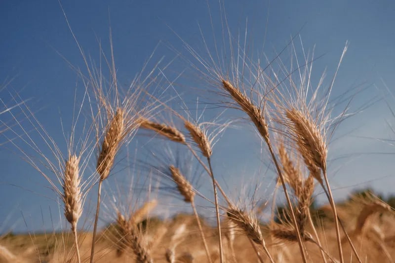
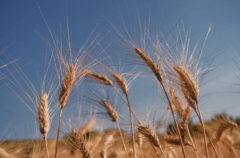
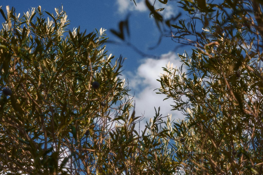
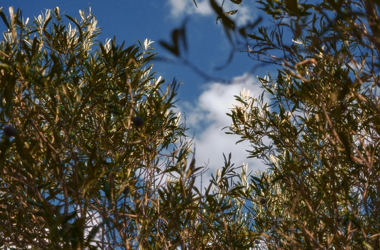
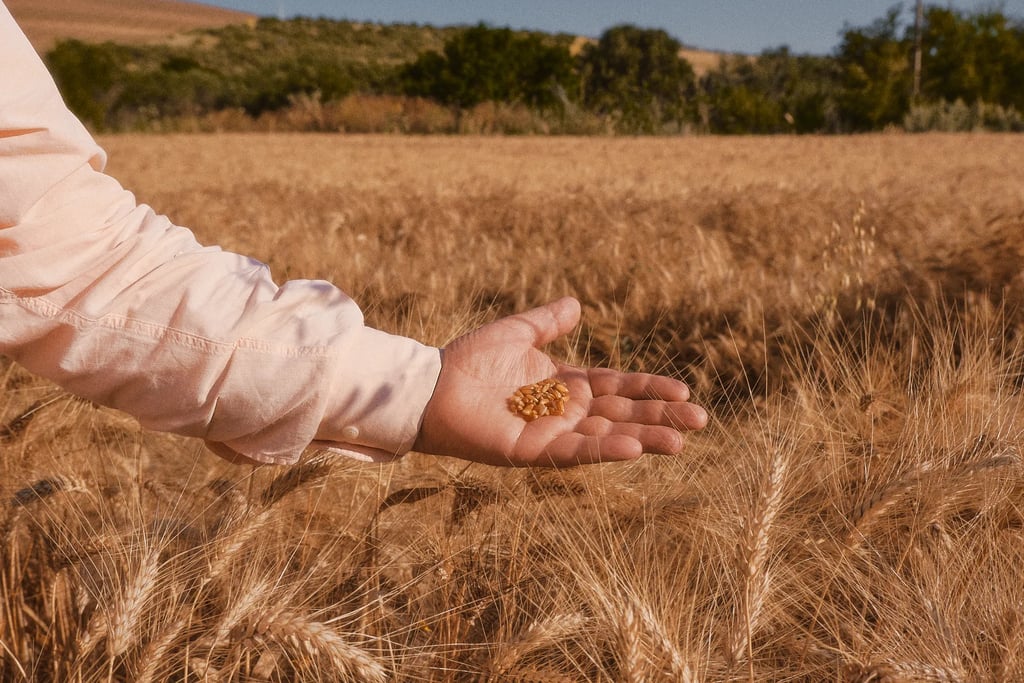
The shots and photography were captured at two precise moments: shortly before the wheat harvest in early July, and during the olive harvest in late October.
No location scouting, zero built sets: the natural beauty of the land of ù Lànnaru at the exact moment its natural resources present themselves, ready for us.
The material tells the real story of the land where Lànnaru's products come from, and gives the brand a credibility no generated image could replicate.
Website
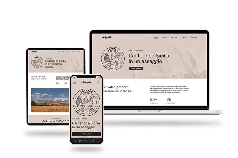
The site isn't a traditional e-commerce store. Lànnaru's production is limited by the size of the land and the harvests: small stock, quality that can't scale without losing something.
Lannaru.com tells the story of the brand's world before it sells anything, from the company's history to growing conditions and the profile of each product.
Purchases work by reservation, guaranteeing delivery to whoever finds it before it sells out.
Results
A brand that turns 67 years of farming work into a commercial proposition that's credible, coherent and recognisable. With a contained print investment and an identity built to grow alongside the business, without disrupting what already works.
Lànnaru is a project in progress. Future iterations will expand the system as the business grows and distribution widens. Every addition will follow the same logic: essential, precise, true to its origin.
Have a product that deserves a better market?
Book a call. Let's see what comes out of the conversation.